Book designers face a knotty conundrum: how do you create a cover that lures bookshop browsers while remaining true to the content within?

Coming up with the design for Jack Hartnell’s study of the physical self in the Middle Ages, ‘Medieval Bodies’, proved how difficult this can be.
Peter Dyer, Art Director at Profile Books, tried out a range of designs before finding the perfect image in Wellcome Collection’s archives, a monochrome drawing of a head and torso, the skin slashed open to expose the organs underneath.
Although Dyer describes his taste as “less is more”, he worked up the original to create a cover that’s teeming with colour and detail. The butchered torso now spills out not blood and guts, but a slew of ornate and outlandish historical imagery. A knight on horseback gallops across the chest cavity, while an azure dragon snakes up the windpipe. A scarlet heart blazes on a pyre near the shoulder blade, and an angel sporting a glimmering halo skulks near a ventricle.
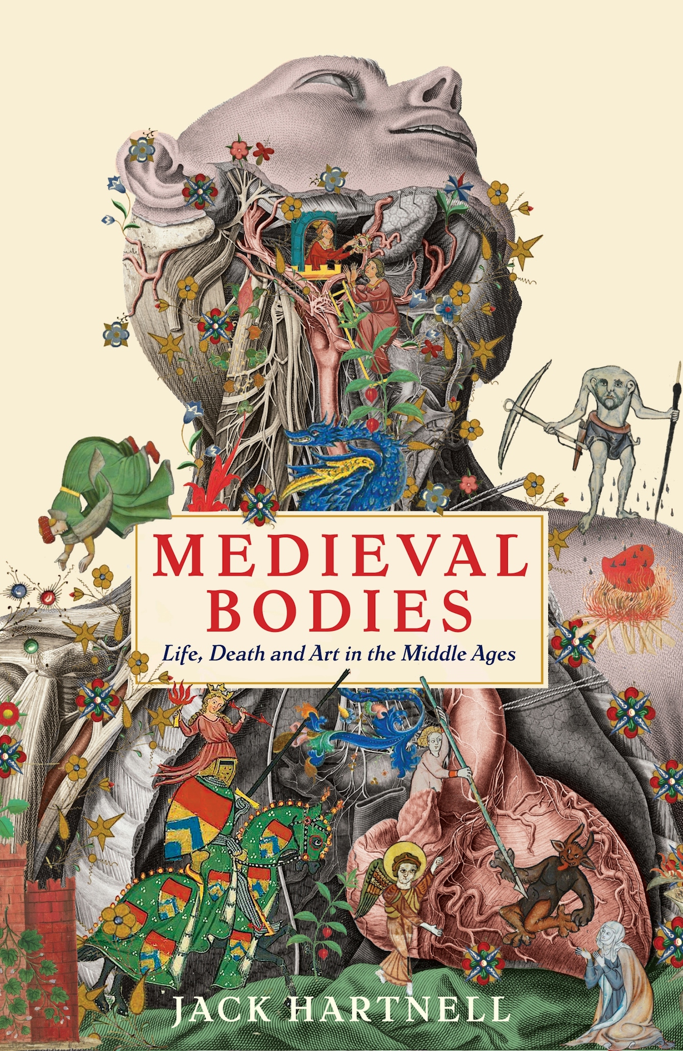
The cover of Medieval Bodies as published. © Profile Books.
"The book is packed with imagery, so I wanted the cover to convey that scope, complexity and liveliness,” says Art Director Peter Dyer.
This departure from minimalism is because, “For me the content drives the direction,” says Dyer. “The book is packed with imagery, so I wanted the cover to convey that scope, complexity and liveliness.” Indeed, Hartnell’s history is peopled by all manner of figures, both real and imagined, from medieval life. Monks, mystics, mythical creatures and royalty all put in an appearance as the writer explores the medieval world view from the eminently fertile starting point of the body.
The quest for inspiration
After he got the initial brief, Dyer scanned through the pictures set to feature in the book but couldn’t find a standalone image suitable for the cover.
Instead, he commissioned San Francisco-based artist Travis Bedel, who is known for his colourful anatomical drawings, to produce an illustration. But the team at Profile Books didn’t consider Bedel’s botanical-inspired design to be the right fit. Even after Dyer lent it a more overtly medieval aesthetic, it didn’t get the green light.
The evolution of a cover
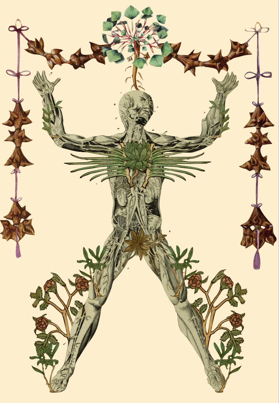
Early illustration for the Medieval Bodies cover, Travis Bedel. © Travis Bedel.
1 of 5
Illustrator Travis Bedel's original botanical-inspired design.
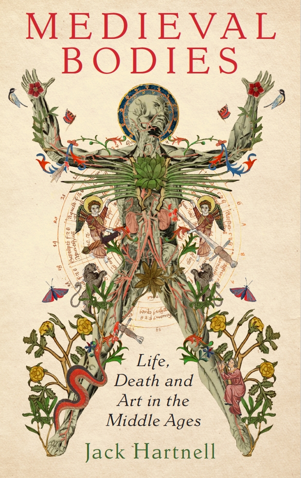
Medieval Bodies book cover design in progress using an illustration by Travis Bedel. © Profile Books.
2 of 5
The original illustration, given a more medieval aesthetic.
3 of 5
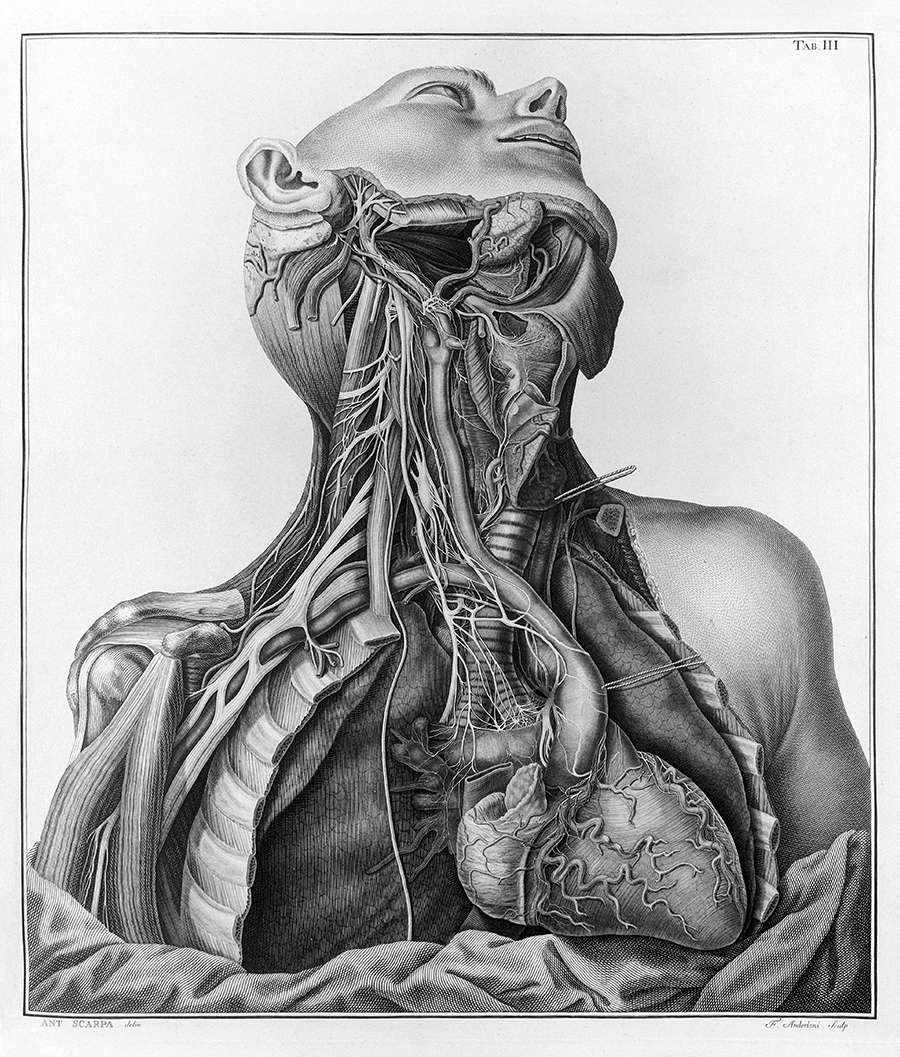
The drawing unearthed from the collections by author Jack Hartnell.
Medieval Bodies book cover design in progress. © Profile Books.
4 of 5
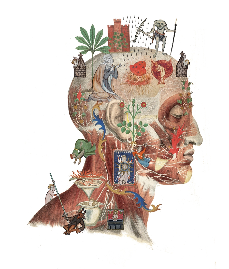
A side profile based on the drawing, imbued with colour and medieval figures interacting with the head, was also explored.
The cover of Medieval Bodies as published. © Profile Books.
5 of 5
In the end, they went for "the gorier option", a combination of the two preceding images. "The open chest draws you in," explains Dyer.
Then Hartnell produced the head and torso sketch, which he’d stumbled across while sifting through the Wellcome Collection archive. They’d found their inspiration.
“With that base sketch,” said Dyer, “I could add the figures and interact them with the body so it almost became one image.” He also tried another rough design with a profile of a head, but this was discarded in favour of the gorier option. “The open chest draws you in – you look at it and it has more and more detail.”
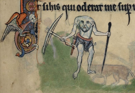
A member of the Blemmyae, a headless African race, as illustrated in the English prayerbook the Rutland Psalter, 1260. Source: Medieval Bodies by Jack Hartnell. Attribution 4.0 International (CC BY 4.0).
The Blemmyae, one of whom appears on the left-hand shoulder of the figure on the cover, was first illustrated in an English prayer book called the Rutland Psalter, which dates from around 1260.
Dyer’s favourite figure in the final composition is the headless creature armed with a bow and arrow who stands, with more than a small degree of menace, on the shoulder of the corpse. This image also appears in the book: it’s one of the Blemmyae, the headless African race with which Hartnell kicks off the chapter about the head. “The headless figure's quite a strong visual device in drawing you into the cover,” says Dyer. “He’s got that slight craziness about him. Medieval images are often quite mad and eccentric-looking.”
Modern with an ancient twist
If you think the cover looks a bit like the antique scrolls that pepper the text, then you’re right. Dyer was aiming to mimic a medieval manuscript, which is also the reason behind the gold foiling adorning the design. Ditto for the material it was printed on: uncoated stock – paper that has a rougher, more natural feel to it – was used to give a sense of eras past.
Font was another way of hinting at manuscripts of yore. Usually when Dyer’s working on something historical, he tracks down a typeface designed during the period. But here he had to strike a balance between authenticity and readability. “A lot of medieval fonts are quite hard to read. Because the cover was so decorative, I wanted something more legible.”
In the end, he chose a modern font with an ancient twist. “There’s a slight medieval quality to the serifs, in the way they curve,” he says, his voice taking on a tender note. (It’s clear he wasn’t understating things when he earlier admitted to being “completely obsessed with typefaces”.)
Colour was also crucial. “Manuscripts are very vivid and I wanted the cover to have that quality too,” says Dyer. The final product is accordingly aglow with jewel-bright hues – especially shades of crimson. This nodded to the book’s medical theme: “It suggested blood and veins.” The plainer backdrop is key to balancing the composition, says Dyer. “When you see books on crowded tables, it’s good for parts of the cover to have calmer areas to help you focus.”
One of the designs Dyer is proudest of in the course of his 35-year career is the William Morris-inspired cover for Sarah Perry’s bestselling novel ‘The Essex Serpent’, published by Serpent’s Tail, an imprint of Profile Books. Clearly, working on the project generated cachet, but another source of gratification was Perry’s enthusiasm for the final design.

Dr Jack Hartnell in the rare book store at Wellcome Collection, Benjamin Gilbert. © Wellcome Collection. Attribution-NonCommercial 4.0 International (CC BY-NC 4.0).
Authors don't usually get the final say on the cover, but it's nice to have their enthusiasm. Jack Hartnell, in the end, thought it was "fantastic".
So, what was Hartnell’s response to the ‘Medieval Bodies’ cover? “I think I got ‘wow’ and ‘fantastic’,” chuckles Dyer. “It’s good when you feel you’ve ended up with the right result even though you’ve gone down different roads to get there.”
Medieval Bodies is published by Profile Books in collaboration with Wellcome Collection.