When wholesale privatisation of the NHS proved unacceptable to the British public, the Thatcher government instead introduced the ‘internal market’ in the 1980s. The resultant scattering of disparate parts of the service then prompted the need for reunification under a corporate brand in the 1990s.
Part5
NHS Blue: the colour of universal healthcare
Cal Flynaverage reading time 6 minutes
- Serial

Mandy English, paramedic. Hull East Ambulance Station, Hull, Thomas SG Farnetti. Source: Wellcome Collection. Attribution-NonCommercial 4.0 International (CC BY-NC 4.0).
The arrival of Margaret Thatcher’s government in 1979 – in the wake of the Winter of Discontent, when ambulance drivers had been among those protesting in the streets – made for an abrupt change in political attitudes towards the NHS.
The Thatcher administration’s privatisation efforts saw the sell-off of council housing stock, and the floatation of British Telecom and British Gas, among others, during the 1980s. But when the government turned its attention to the National Health Service, the force of popular opinion was such that the suggestion of privatisation had to be immediately dropped – and the attempt denied.
Years later, while writing his memoirs, the former Chancellor Nigel Lawson would famously comment: “The NHS is the closest thing the English now have to a religion.” Lawson was expressing retrospective frustration over the furore caused by his government’s abortive attempt to restructure health provision – the first serious demonstration of how deeply the NHS had become embedded in the national consciousness.
Different arms of the NHS began to ‘brand’ themselves – leading to unique looks such as the mixture of fonts used for the Wakefield and Pontefract Community Health logo.
The threat of privatisation
The trouble began when the Central Policy Review Staff – a government think tank – was asked to reimagine the welfare state in 1982. Among the ideas put forward were proposals to charge for state education and to replace the NHS with an insurance-based service. This would, the paper noted, “mean the end of the National Health Service”. It would be “controversial”, it added.
So it was. When presented to ministers, the report caused “the nearest thing to a Cabinet riot in the history of the Thatcher administration”, Lawson recalled. Outrage was such that a section of the report was leaked to the press, causing public outcry – and Thatcher was forced to reassure the country of her continued fidelity at that year’s Conservative conference. “Of course we welcome the growth of private health insurance,” she told delegates. “…But let me make one thing absolutely clear. The National Health Service is safe with us.”
But Thatcher made no secret of her preference for private insurance: the following year, 1983, she was admitted to a private hospital in Windsor to repair the retina in her right eye – paid for by Bupa. (Catering at the hospital was provided by the same firm that supplied the royal family at nearby Windsor Castle.) Three years later, when she returned to hospital for an operation on her hand, the Observer would note that by again going private she had avoided a four-year waiting list in the NHS.
Still, however politically unworkable the break-up of the NHS had proven, some reforms brought in by the Thatcher government would continue long after she had been toppled.
The photographer Alex Liivet noticed the unusual styling of this sign: “This is intriguing, design-wise. It’s using the old NHS signage font (Rail Alphabet) but in a revamped, late 1990s layout and colour scheme. It’s as if somebody didn't get the full memo...”
Creating the internal market
The first step in the corporatisation of the health service was the introduction of a layer of professional managers, as recommended by Sir Roy Griffith, managing director of a supermarket chain. Then a number of non-core services – such as catering and laundry – were franchised out.
“Privatisation was a very big theme of the time, but although some services were now being privately run and delivered, they were still paid for by the state,” explains historian Mathew Thomson, Joint Director of the People’s History of the NHS project. “The key issue of the service being free when you receive it was not touched. It matters, the public disquiet over something like that.”
But by 1987 many health authorities were in debt and waiting lists were growing, despite an increase in expenditure. Thatcher commissioned a fresh review: one that would lead to the most radical reforms in NHS history. The result, the ‘Working for Patients’ white paper in 1989, paved the way for the introduction of a so-called ‘internal market’ – a model in which some arms of the NHS (health authorities and GP surgeries) would ‘purchase’ care from NHS ‘providers’, like hospitals and ambulance services.
While this system was billed as bringing better value for money, it also had the potential to increase variation in care and regional inequalities. After devolution in 1998, Wales and Scotland both elected to do away with the internal market system, reflecting the different political climates over the borders. (The health service in Northern Ireland has another name entirely: Health and Social Care, or HSC.)
Faces of the NHS: 1980s and 1990s

Heather Smith, consultant pharmacist. St James's University Hospital, Leeds, Benjamin Gilbert. Source: Wellcome Collection. Attribution-NonCommercial 4.0 International (CC BY-NC 4.0).
1 of 3
Heather Smith, who today is a consultant pharmacist for older people and interfaces of care, first became qualified in 1992: “I knew very little about the NHS, certainly nothing about how it worked and what a huge organisation it was to work in.” She was present for the administrative changes of the era. “Relatively early in my career, the concept of Trusts came about, so that was new. I think in my first job there were only two Trusts in the whole of the country... you knew these things were going on, but they didn’t touch you as a person at that point.”

Adrian Godbold, porter. Great Ormond Street Hospital, London, Thomas SG Farnetti. Source: Wellcome Collection. Attribution-NonCommercial 4.0 International (CC BY-NC 4.0).
2 of 3
Adrian Godbold has worked at Great Ormond Street Hospital for 29 years. He recalls the branding changes: “The motto of GOSH is ‘The child first and always’… we had that on our badges at one time, and that for me is what GOSH is about... it’s about the child and nothing else, and giving that child the best treatment and care you possibly can.”

Mandy English, paramedic. Hull East Ambulance Station, Hull, Thomas SG Farnetti. Source: Wellcome Collection. Attribution-NonCommercial 4.0 International (CC BY-NC 4.0).
3 of 3
Mandy English began working for the ambulance service in 1997: “I decided to go into the ambulance service because I wanted to work in healthcare and I kind of liked the idea of nursing, but the ambulance service appealed more because you get out and about.” Working for the NHS has made her appreciate it even more because “we’re lucky that we’ve got it... we’re lucky that whatever happens to us we’re going to be looked after, from the cradle to the grave.”
NHS brand guidelines
Until this point, a monolithic bureaucracy ran all aspects of the health service. But after the internal market was established the organisation became increasingly fragmented and its identity more diffuse. New Labour came to power in 1997, elected with a promise to do away with the internal market system, but this plan was soon abandoned. Different arms of the NHS, in competition with one another, took further inspiration from the private sphere and began to ‘brand’ themselves – leading to a profusion of logos – more than 600 at one point, according to one estimate.
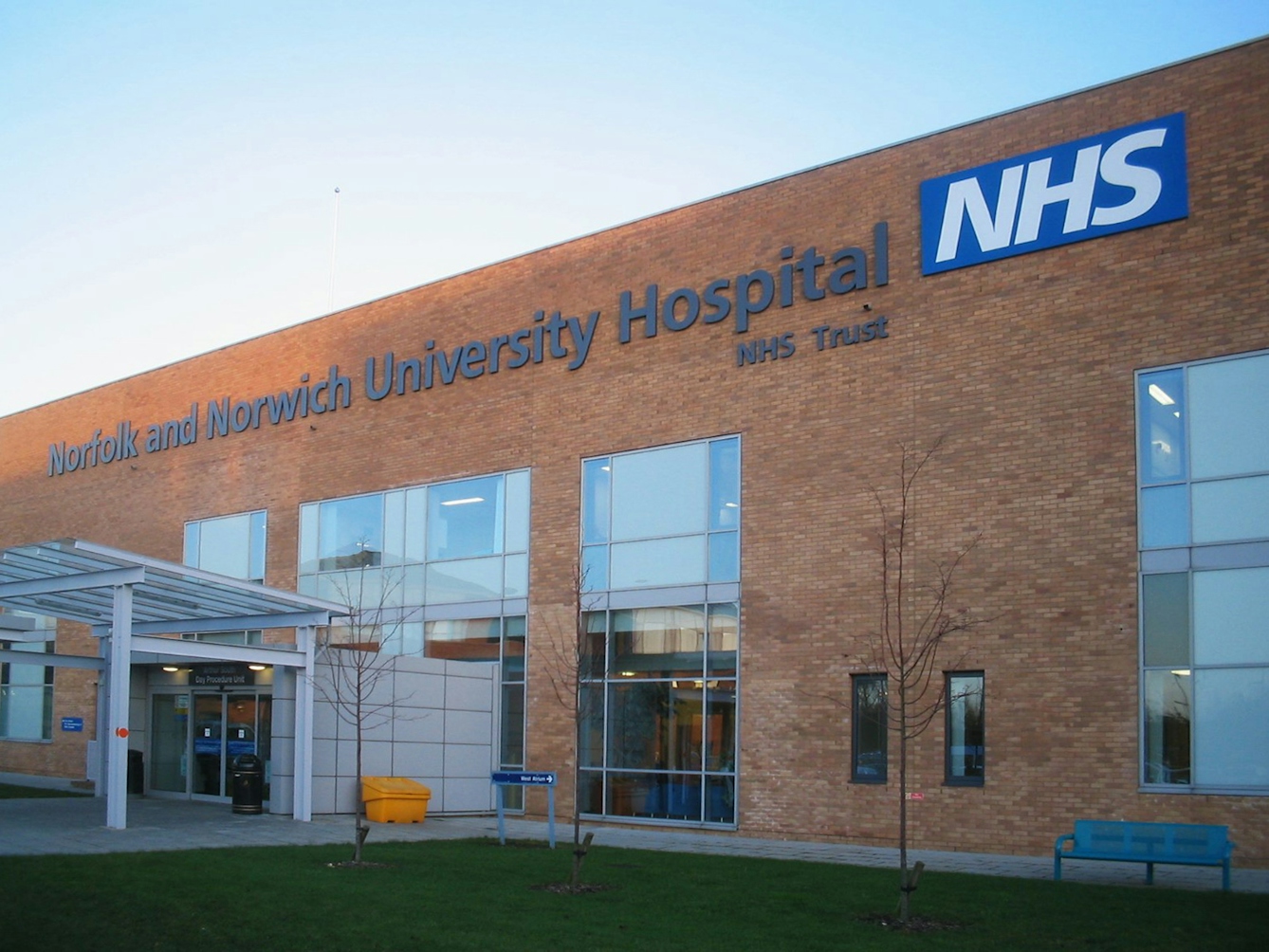
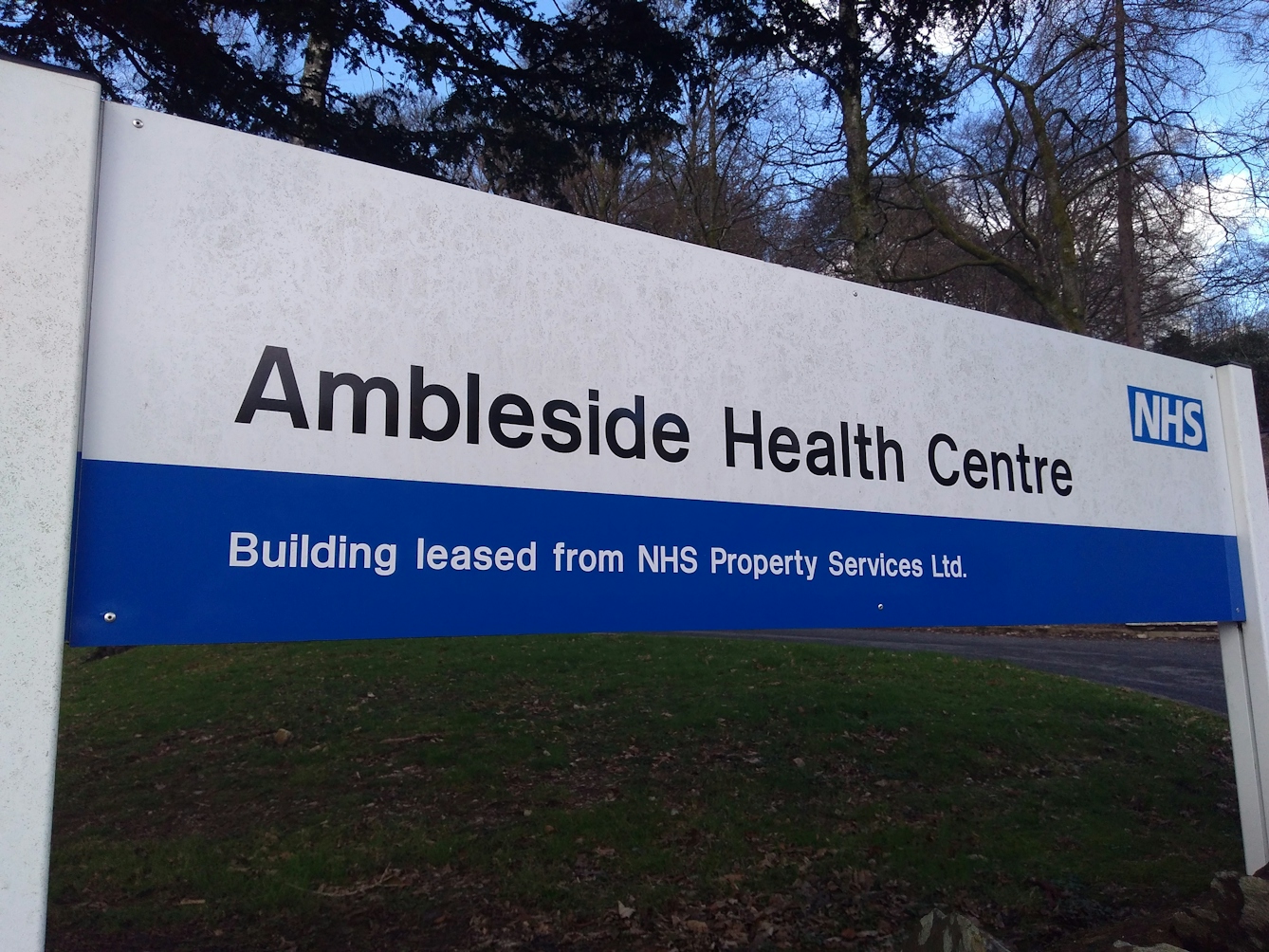
Today, most NHS hospitals have uniform styles of signage and feature the NHS logo prominently.
As a result, a logo was devised under which the many sections of the NHS would be united: the ‘blue lozenge’ in Pantone 300 – a shade now known as ‘NHS blue’. Today the logo, colour and even font (Frutiger Bold Italic, in white) are instantly recognisable.
Though at first glance the rebranding of the NHS may seem like a superficial exercise, it marks an interesting stage in the organisation’s evolution in the public imagination. Back in 1948, the NHS had not been built from the ground up, but rather inherited a great many hospitals with pre-existing buildings and characters familiar to their local populations; this meant that despite the political fanfare, reaction to the new health service had been relatively muted – to the casual hospital visitor, little had changed. It had been “a kind of challenge of the imagination”, Thomson explains.
NHS logo, NHS England. Source: NHS England.
NHS England provide a style guide, including logo vectors, to ensure that the service is presented properly.
The logo of a unified identity
The new visual language created in the 1990s – by which each disparate element could be clearly labelled as part of a greater whole – therefore played a big role in cementing the idea of the NHS as a single conceptual entity. “Whether intentionally or not, that brand exercise was useful in giving the NHS a much stronger identity,” adds Thomson.
During the same period, we see this echoed in the way the NHS is discussed in the press: in the early decades, it is regularly referred to more generally as the ‘health system’ or similar terms; only in the 1990s does the use of the terms ‘National Health Service’ and ‘NHS’ shoot up. Thomson explains, “And it’s not just use of the name, but the preoccupation with it that has leapt exponentially across this period. That’s an important part of the story.”
Today the NHS polices the use of this brand – its colours, fonts and logos – very carefully, and views it as a key way of maintaining awareness of and public confidence in state healthcare. Research has found the brand to be instantly recognisable to 98 per cent of people, and that it evokes high levels of trust, reassurance and pride. Truly, the NHS has come to be seen as something greater than the sum of its parts.
About the contributors

.jpg)
Cal Flyn
Cal Flyn is a writer and reporter from the Highlands of Scotland. She writes across the British press, including the Guardian, the Sunday Times, the Daily Telegraph, Prospect and New Statesman. Her first book, ‘Thicker Than Water’, was published by William Collins in 2016, and selected by the Times as one of the best books of that year.