HomePart 8 of Inclusive Exhibition Design Toolkit

Gallery guides and large-print guides

Image shows a display of gallery guides outside the entrance to the Misbehaving Bodies exhibition.

We produce a gallery guide for every exhibition at Wellcome Collection. Certain key elements of style and content are consistent across all exhibition guides:

  • Fonts have a minimum x height of 1.75 mm (equivalent of Arial 9.5 pt). Leading should be greater than the x height of the letters. Line length should be no longer than 55 characters. Text should be left-aligned, with right margins kept ragged
  • Inclusion of a simplified exhibition map
  • Paper size is 140 x 210 mm, but the page count can vary
  • Paper inside the guides is uncoated white 100 gsm. The cover paper stock can be unique to each exhibition
  • Position of exhibition title piece, in black or white
  • Position of the Wellcome Collection logo block, in black or white
  • Position of the dates of exhibition, in black or white

Beyond that, each gallery guide uses the exhibition’s unique title treatment, graphic identity and fonts.

There are no further restrictions on the type of content or internal layout contained in a gallery guide, which is to be devised by the exhibition’s curator in collaboration with the graphic designer.

Download the gallery guide template:

Wellcome Collection Gallery Guide templates

Large-print guides

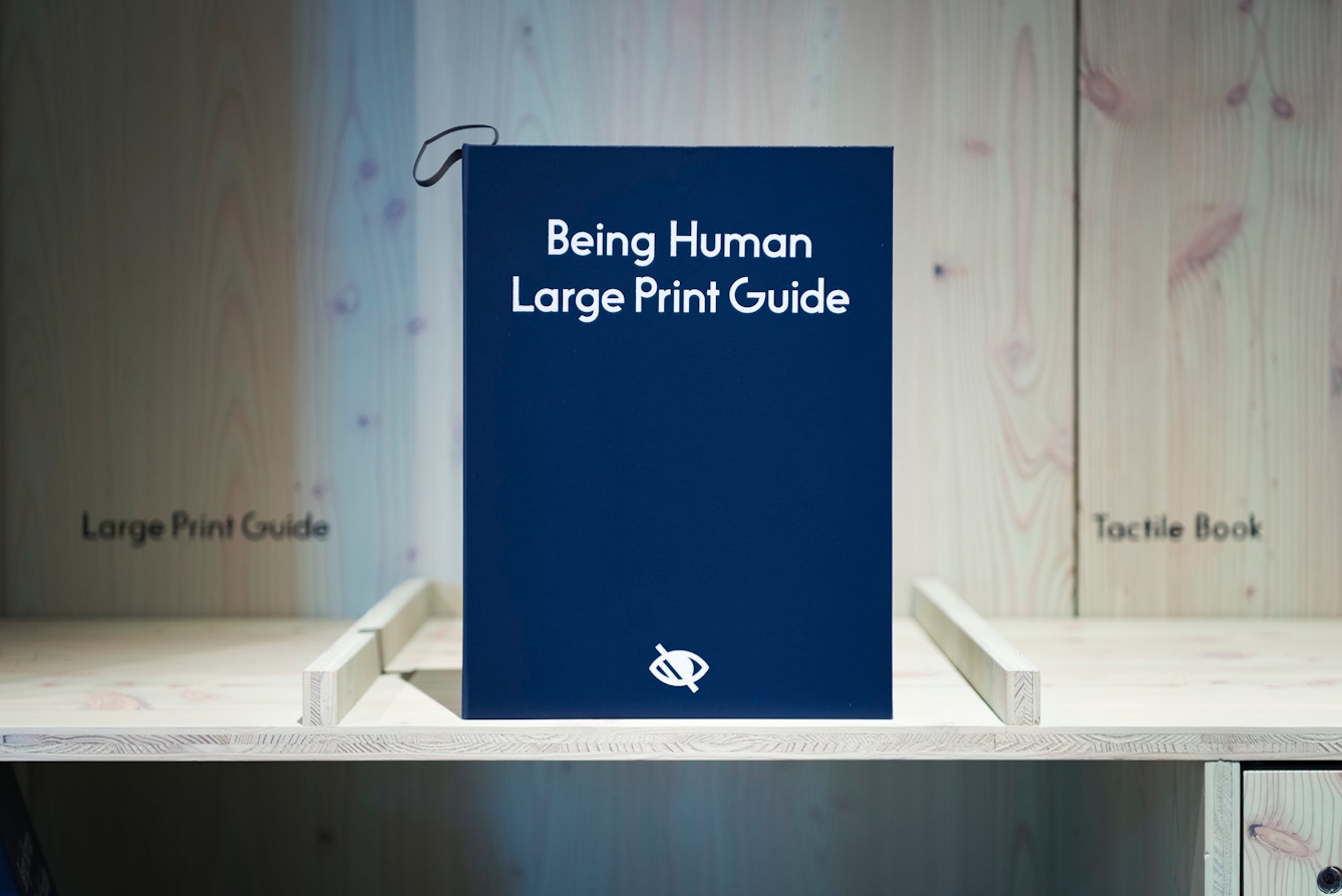
Image shows the cover of a large print guide in the Being Human gallery. The title appears in large font in high contrast and the symbol for visual disability also appears on the cover.
Being Human large print guides, Thomas S.G. Farnetti. Source: Wellcome Collection. Attribution-NonCommercial 4.0 International (CC BY-NC 4.0).

The cover of a large-print guide in the ‘Being Human’ gallery.

Style and content of large-print guides

We produce a large-print guide for every exhibition at Wellcome Collection. The style and content of these is consistent across all exhibitions:

  • “Large print guide” clearly printed on front cover
  • Shaded eye symbol clearly printed on top and bottom corners on front and back covers
  • Fonts have a minimum x height of 3.3 mm (equivalent of Arial 18 pt). Leading should be greater than the x height of the letters. Line length should be no longer then 55 characters. Text should be left-aligned, with right margins kept ragged
  • Pages numbered
  • Maximum contrast of type colour on its background
  • Inclusion of all exhibition texts: introduction, section panels, labels and any other print interpretation (such as transcripts)
  • Inclusion of a simplified exhibition map
  • “You are here” indicators (for each section) to show the visitor where they are in the exhibition’s flow and map
  • Indicators for any accessible elements such as touch objects, T-loop symbols, audio description
  • A4 paper size
  • Minimum paper weight 80 gsm
  • Position of the Wellcome Collection logo block
  • Spiral-bound with stiff backing and card cover

If texts are long, the large-print guide may be heavy and unwieldy. It may be preferable to split the guide into sections, in which case we will need to consider where in the exhibition design to place them.

If a gallery guide’s content is different from the exhibition’s text panels, we will also produce a large-print version of the gallery guide, using the same template as the large-print guide.

Download the large-print guide template:

Wellcome Collection Large print Guide templates