The book : the story of printing & bookmaking / by Douglas C. McMurtrie.
- Douglas Crawford McMurtrie
- Date:
- 1948
Licence: In copyright
Credit: The book : the story of printing & bookmaking / by Douglas C. McMurtrie. Source: Wellcome Collection.
85/744 page 49
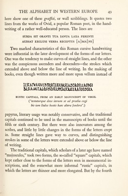
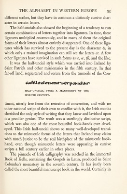
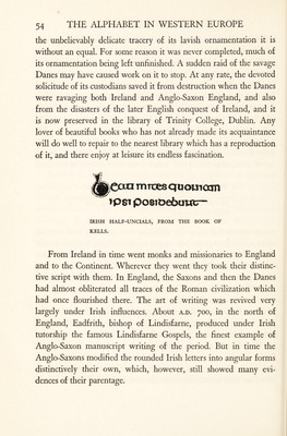
![here show one of these graffiti, or wall scribblings. It quotes two lines from the works of Ovid, a popular Roman poet, in the hand¬ writing of a rather well-educated person. The lines are SURDA SIT ORANTI TUA IANUA LAXA FERENTI AUDIAT EXCLUSI VERBA RECEPTUS [a]ma[ns] Two marked characteristics of this Roman cursive handwriting were influential in the later development of the forms of our letters. One was the tendency to make curves of straight lines, and the other was the conspicuous ascenders and descenders—the strokes which extended above and below the line of writing. In the making of books, even though written more and more upon vellum instead of II5IAIV AQVf 5!OilUiVA\5.lAfitKO£il AC061 Miimmo^rtastim^cjuiiuioioax RUSTIC CAPITALS, FROM AN EARLY MANUSCRIPT OF VIRGIL (testaturque deos iterum se ad proelia cogi bis iam halos hostis haec altera foedera'.) papyrus, literary usage was notably conservative, and the traditional capitals continued to be used in the manuscripts of books until the fifth or sixth century. But there were also innovators among the scribes, and little by little changes in the forms of the letters crept in. Some straight lines gave way to curves, and distinguishing strokes in some of the letters were extended above or below the line of writing. The traditional capitals, which scholars of a later age have named “majuscules,” took two forms, the so-called “square” capitals, which kept rather close to the forms of the letters seen in monumental in¬ scriptions, and the somewhat more informal “rustic” capitals, in which the letters are thinner and more elongated. But by the fourth](https://iiif.wellcomecollection.org/image/b30009455_0085.jp2/full/800%2C/0/default.jpg)