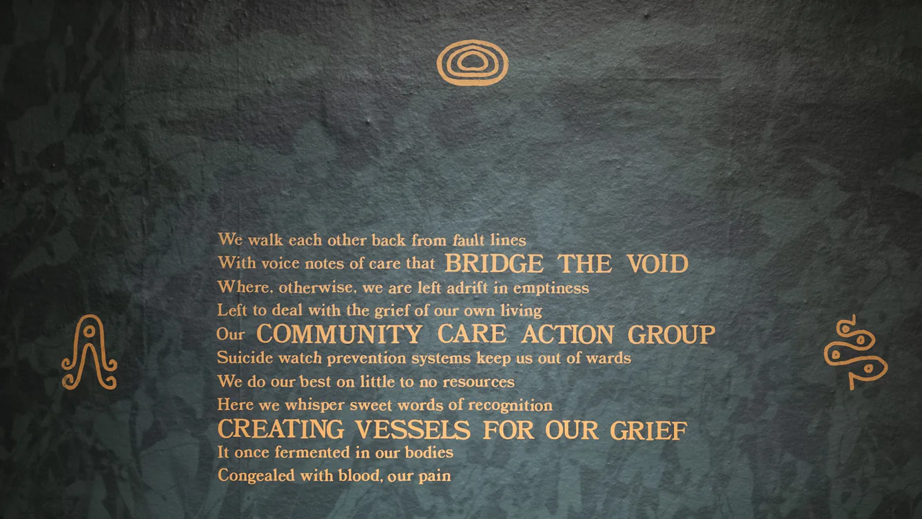
To your left if you are facing the QR code is a large two-metre high, 1.5-metre-wide poster pasted directly onto the wall. The surface of the paper is a deep forest green dappled with sage green, in a slightly geometric pattern, like light reflecting off rippling water. There are three blocks of golden-yellow text arranged diagonally on the paper.
Loewe will read this text for you now:
“We walk each other back from fault lines
With voice notes of care that bridge the void
Where, otherwise, we are left adrift in emptiness
Left to deal with the grief of our own living
Our community care action group
Suicide watch prevention systems keep us out of wards
We do our best on little to no resources
Here we whisper sweet words of recognition
Creating vessels for our grief
It once fermented in our bodies
Congealed with blood, our pain
We hold each other
Huddled together, like birds in a nest
Cast out to the open wind
Nothing protecting us from the great sea
An abyss, an absence
Our community spaces eroded
The intentional wearing-down of the network
That keeps us together
The tapestry of care
An unspoken mutual aid group
The library, the community centre
Gone
We dream together of reverie
Of belly full laughter
Where care looks like
Plantain and sweet potato
The tingle of scotch bonnet on your lips
Where grief is let out through dance
And rage is given room to breathe
We lament all that has been taken from us
And we dream and we dream and we dream.”
In each corner of the poster is a symbol made of yellow lines. In the top left it resembles a sea creature, with four tentacles that each curl into a spiral at the end. The top-right symbol looks like a snake in a zig-zag shape, wider at the bottom than the top. The symbol at the bottom right appears like a heart-shaped nut. And the bottom left is simply two lines leaning towards each other, over two symmetrical pincer shapes.
At the bottom of the poster, between two of these symbols, is a spiral of text which reads:
“The ‘we’ here are the queer, trans, intersex, disabled Black people and people of colour I have lovingly felt in community with.”
The tactile symbol that accompanies this work on an angled label holder to the right – which you are invited to touch – looks like a tightly coiled spring. At the top and the bottom of the spring, the black line of the coil splits into four strands that splay out diagonally.
Next to the tactile symbol is an invitation by Rudy Loewe, which they will now read for you:
“This work is only possible because I have been held together now for many years by a community of disabled co-conspirators who have buoyed my spirit with loving whispers; through tender voice notes, attending appointments and raging on my behalf when all the energy has left my body. ‘Intimacies of Care’ is inspired by Mia Mingus’s ‘access intimacy’, which she describes as ‘the intimacy [she feels] with many other disabled and sick people who have an automatic understanding of access needs out of our shared similar lived experience of the many different ways ableism manifests in our lives.’
In these intimate spaces, we* hold each other’s grief and dream new possibilities of care. The care that we are yet to receive from the state, and that we may never receive from such a place.
The tactile element for this text is about the magic of the collective.”
This is the end of track 3. If you are facing the QR code then the tactile path continues to your left towards the next artwork.