Hello, my name is Sue Mayo, and I’m a freelance arts practitioner. Visual artist Skye Baker and I worked on the project ‘It’s on the Cards’ with a group of ten-year-olds and a group of older adults, brought together by the intergenerational arts charity Magic Me. The project explored ageing and ageism through making and examining birthday cards.
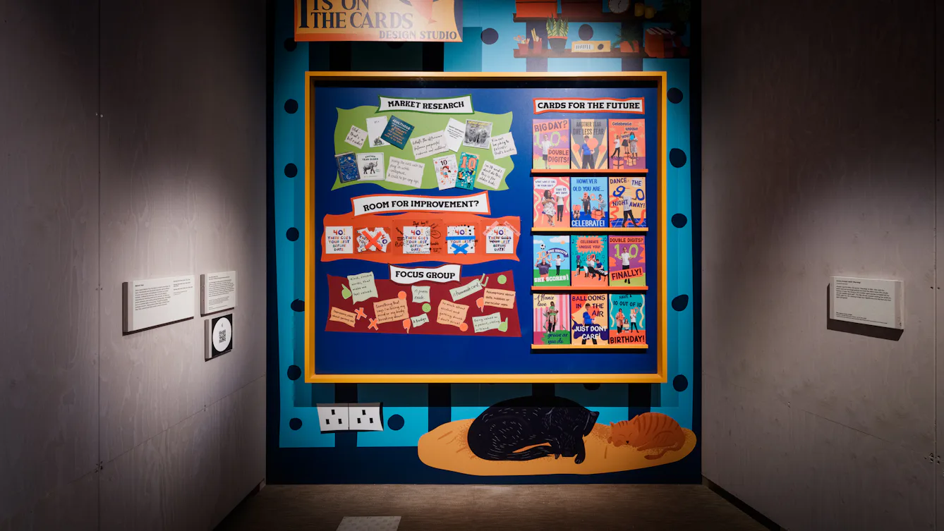
The artwork in front combines illustrated wallpaper with a framed collage – roughly three metres by three metres square – which portrays a brightly coloured and busy wall in a fictional design studio.
The overall style of the work is flat and graphic. The background wall of the studio is covered with a vibrant wallpaper in dark blue and light blue vertical stripes, decorated with large blue polka dots. In the top left corner, a yellow sign with an orange balloon graphic hangs from black chains, displaying “It’s on the Cards Design Studio” in bold blue text.
In the centre of the wall is a large blue bulletin board, approximately two metres square, framed by a thick yellow border. The board is organised into two distinct halves. On the left-hand side, the group’s research is presented in three horizontal sections.
Towards the top right-hand corner of the illustration are two wooden shelves with drawings of various office items, including colourful storage boxes, a clock, potted plants and books. There is a drawing of a cat and dog sleeping on a yellow bed in the bottom right-hand corner.
The top section is called ‘Market Research’. Below the title, various greeting cards and handwritten notes are pinned against a background that is a light green rectangular shape with wavy edges. One birthday card towards the top left of this section shows a drawing of a tortoise with one word – “Old” – written above it.
The middle section is called ‘Room for Improvement?’. Below this title, against an orange rectangular background with wavy edges, is a row of five copies of a 40th birthday card that has the message: “There goes your best before date!” These words have been crossed out and annotated with comments like “Don’t buy!” and “Ignore this!”.
The bottom section is called ‘Focus Group’. Below the title is a purple rectangular background shape on which are stuck handwritten feedback notes about birthday cards.
On the right side of the board at the top is the title ‘Cards for the Future’. Below this are four narrow display shelves with three colourful modern greeting-card designs on each. These cards feature photographs of the participants. Overlaying the photos are positive messages around age, including “Double digits, finally!”, “Another year, one less fear”, and “What was it like in my day? It is my day!”.
Collaboration was central in this project. We wanted everyone, whatever their age, to feel valued and trusted. We asked them to become co-researchers of how attitudes to age are reflected in birthday cards. They enjoyed being investigators and brought back thoughts from friends and family from around the world.
Skye and I worked closely, blending drama games, conversation, design, making, and relationship-building to ensure everyone was included. Working collectively meant listening and accepting different reactions. Recognising we are all shaped by our own life experiences.
We were surprised at how quickly people took ownership, felt comfortable sharing opinions, and made connections. They shared the same favourites and least favourite cards, yet were nuanced; children led a discussion on when something was “banter” or “cruel teasing”, depending on how well you knew the recipient.
The bought cards revealed assumptions and stereotypes about age, gender, alcohol and pastimes. We had fun finding cards that confirmed societal ageism and sexism. Looking at these allowed participants to hear how it felt to receive greetings suggesting you should be young again, were past your sell-by date, that only boys played football.
We invited the group to notice, challenge and improve the cards, which they did by deleting or altering words, changing images, or, in one case, ripping a card up. This empowered them to understand that what society writes in birthday cards does not need to define how we celebrate ageing. The cards they designed themselves are joyful and fearless.
We hope the artwork invites people to ask what they would really like to receive in a card, what might make someone feel special and valued, and challenges the idea that knowing someone’s age tells you all about them.
This is the end of Stop 6.